
Lesson 8 · Working with data
Charts: one variable
Build your first charts with ggplot2, a layer at a time.
Set up
library(tidyverse)
students <- read_csv("data/students.csv", show_col_types = FALSE) %>%
  mutate(Motivation = factor(Motivation, levels = c("Low", "Medium", "High")))
The recipe
ggplot(students,
which column goes whereaes(x = ExamScore))
what to drawgeom_histogram()
Every ggplot chart is built from these three parts, joined with +.
Data and aesthetics alone give an empty canvas:
ggplot(students, aes(x = ExamScore))
Add a geom with +:
ggplot(students, aes(x = ExamScore)) +
  geom_histogram()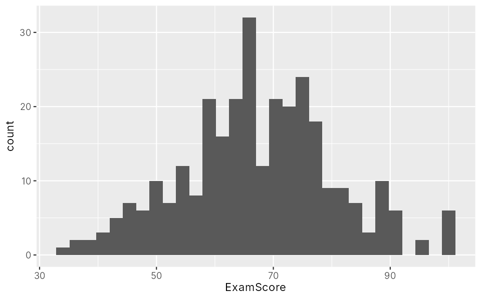
The message suggests choosing a bar width. Let's do that.
Histograms: one number
A histogram shows how values are spread: where most are, and how wide the spread is.
ggplot(students, aes(x = ExamScore)) +
  geom_histogram(binwidth = 5, fill = "steelblue", colour = "white")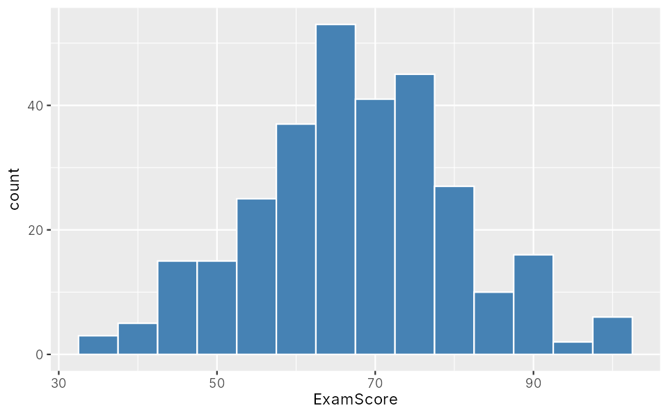
binwidth = 5: each bar covers 5 marks.fillcolours the bars,colourtheir outline.
Colour by group
Put fill inside aes() to colour by a column. facet_wrap() gives each group its own panel:
ggplot(students, aes(x = ExamScore, fill = Gender)) +
  geom_histogram(binwidth = 5, colour = "white") +
  facet_wrap(~ Gender)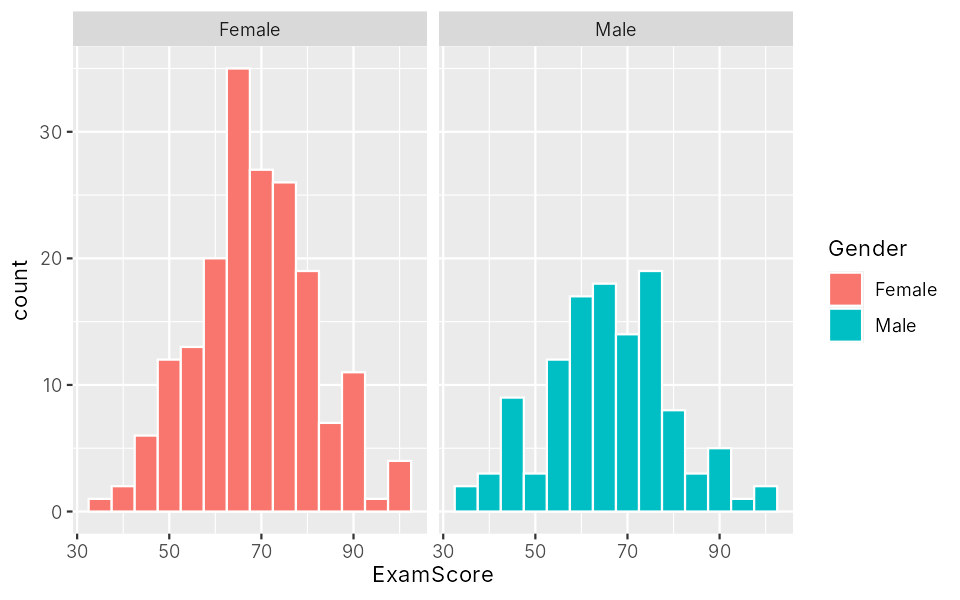
fill = "steelblue"
sets one colour for all
aes(fill = Gender)
colours by a column, adds a legend
Bar charts: categories
geom_bar() counts rows in each category:
ggplot(students, aes(x = Motivation)) +
  geom_bar()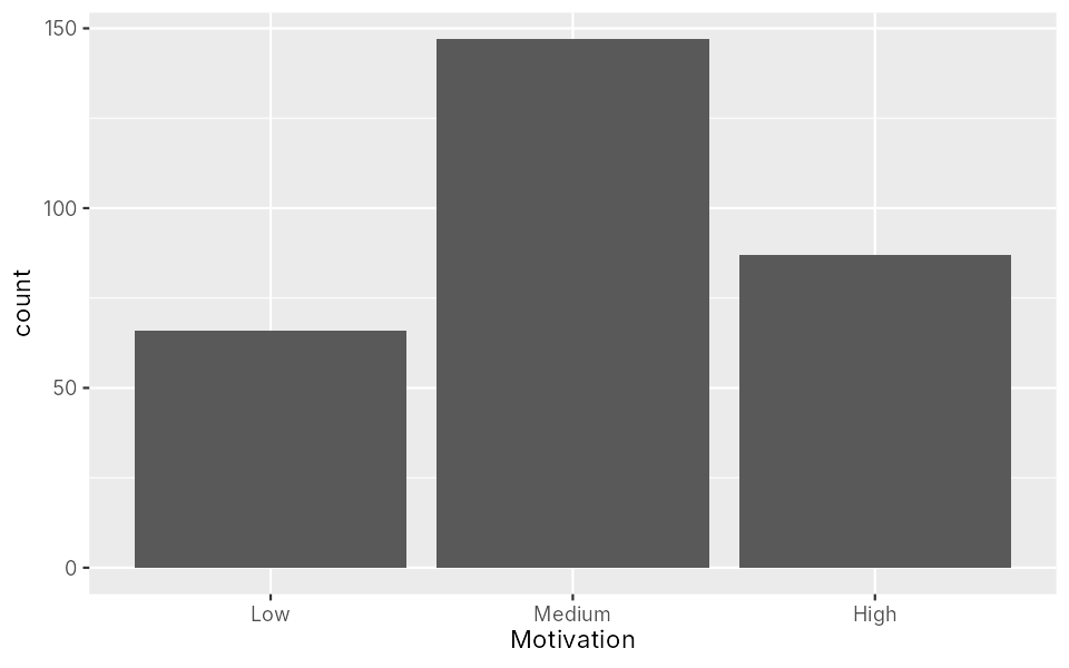
Split each bar by another category with fill, side by side with position = "dodge":
ggplot(students, aes(x = Motivation, fill = Gender)) +
  geom_bar(position = "dodge")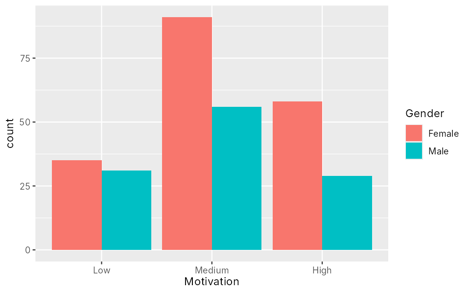
Exercises
Histogram of sleep
Make a histogram of Sleep with bars half an hour wide (binwidth = 0.5). What does the warning mean?
Show answerHide answer
ggplot(students, aes(x = Sleep)) +
geom_histogram(binwidth = 0.5, fill = "darkseagreen", colour = "white")Warning message:
Removed 10 rows containing non-finite outside the scale range
(`stat_bin()`).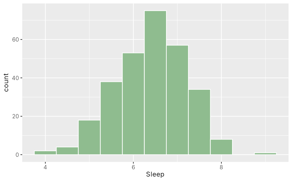
Most students sleep 5.5 to 7.5 hours. The warning says 10 rows were left out: the students with no sleep answer.
Bar chart
Make a bar chart of Living (Hall or Home), split by Workshop, side by side.
Show answerHide answer
ggplot(students, aes(x = Living, fill = Workshop)) +
  geom_bar(position = "dodge")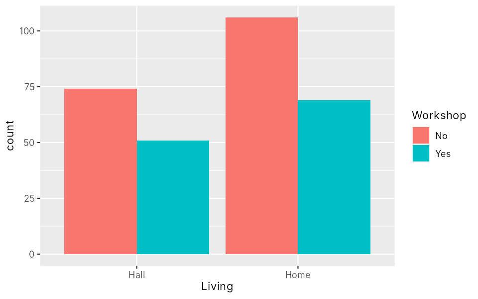
Key points
ggplot(data, aes(...)) + geom_...()- Histogram = one number; bar chart = counts of categories.
- Inside
aes()maps a column; outside sets a fixed look.