
Lesson 9 · Working with data
Charts: compare & relate
Compare groups with boxplots, show relationships with scatter plots, and make charts ready for a report.
Set up
library(tidyverse)
students <- read_csv("data/students.csv", show_col_types = FALSE) %>%
  mutate(Motivation = factor(Motivation, levels = c("Low", "Medium", "High")))
Boxplots: compare groups
ggplot(students, aes(x = Motivation, y = ExamScore)) +
  geom_boxplot()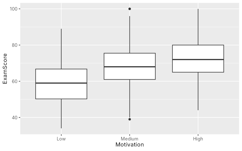
How to read one box:
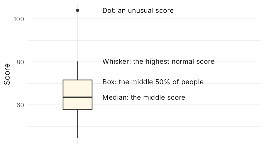
Add geom_jitter() to show every student as a dot:
ggplot(students, aes(x = Motivation, y = ExamScore)) +
  geom_boxplot() +
  geom_jitter(width = 0.15, alpha = 0.4)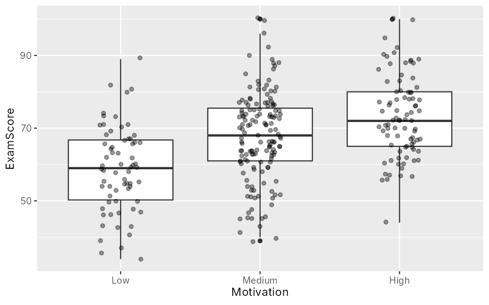
alpha sets see-through-ness (0 to 1). The jitter is random, so your dots will differ a little.
Scatter plots: two numbers
ggplot(students, aes(x = StudyHours, y = ExamScore)) +
geom_point(alpha = 0.6)Warning message:
Removed 6 rows containing missing values or values outside the scale
range (`geom_point()`).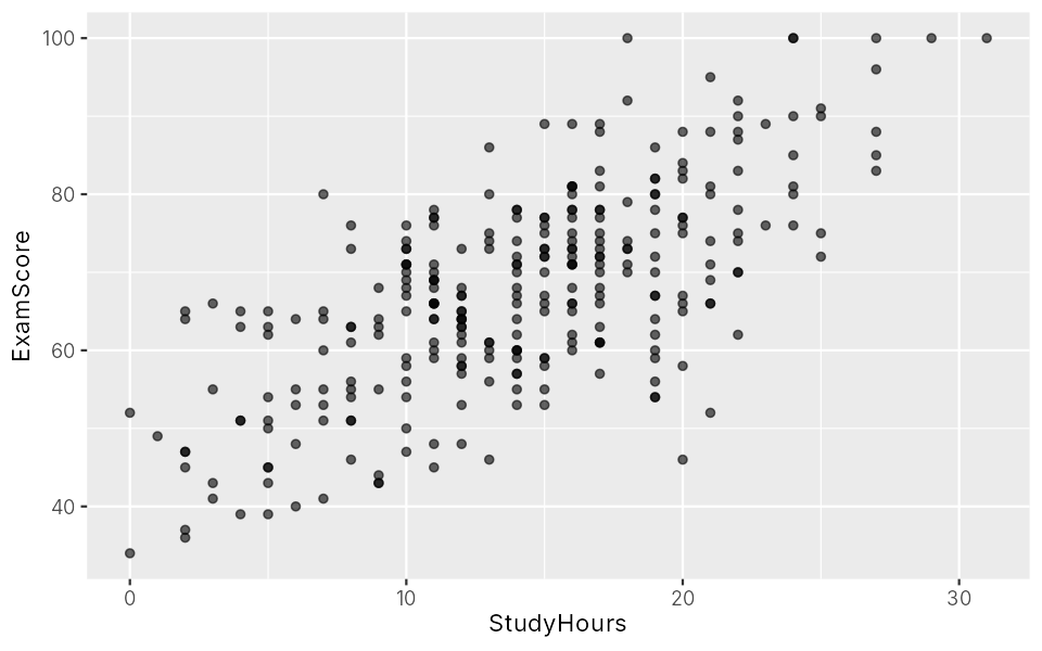
More study, higher scores. The warning: 6 students have no study hours, so they can't be drawn.
Add a straight trend line with geom_smooth(method = "lm"):
ggplot(students, aes(x = StudyHours, y = ExamScore)) +
  geom_point(alpha = 0.6) +
geom_smooth(method = "lm")Warning messages: 1: Removed 6 rows containing non-finite outside the scale range (`stat_smooth()`). 2: Removed 6 rows containing missing values or values outside the scale range (`geom_point()`).
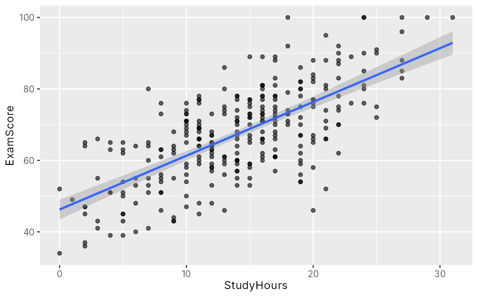
The grey band shows how sure we are about the line.
Make it report-ready
ggplot(students, aes(x = StudyHours, y = ExamScore)) +
  geom_point(alpha = 0.6, colour = "steelblue") +
  geom_smooth(method = "lm", colour = "black") +
  labs(title = "Study time and exam score",
       x = "Study hours per week",
       y = "Exam score (out of 100)") +
theme_classic()Warning messages: 1: Removed 6 rows containing non-finite outside the scale range (`stat_smooth()`). 2: Removed 6 rows containing missing values or values outside the scale range (`geom_point()`).
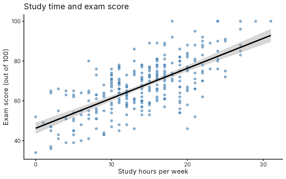
labs()sets the title and axis labels.theme_classic()gives a clean look. Trytheme_minimal()too.
Save the last chart as an image file in your project folder:
ggsave("study-exam.png", width = 6, height = 4, dpi = 300)Which chart?
| Question | Chart | Geom |
|---|---|---|
| How is one number spread? | Histogram | geom_histogram() |
| How many in each category? | Bar chart | geom_bar() |
| Do groups differ on a number? | Boxplot | geom_boxplot() |
| Do two numbers go together? | Scatter plot | geom_point() |
Exercises
Boxplot
Compare Stress between students living in a hall and at home, with a boxplot and jittered dots.
Show answerHide answer
ggplot(students, aes(x = Living, y = Stress)) +
  geom_boxplot() +
  geom_jitter(width = 0.15, alpha = 0.3)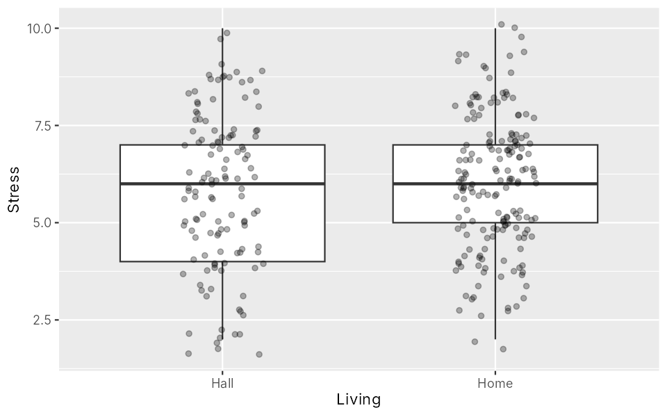
The two groups look very similar.
Scatter plot
Plot Sleep (x) against Stress (y) with a trend line, clear labels and theme_minimal(). What does the line show?
Show answerHide answer
ggplot(students, aes(x = Sleep, y = Stress)) +
  geom_jitter(width = 0, height = 0.2, alpha = 0.5) +
  geom_smooth(method = "lm") +
  labs(x = "Hours of sleep per night", y = "Stress (1 to 10)") +
theme_minimal()Warning messages: 1: Removed 10 rows containing non-finite outside the scale range (`stat_smooth()`). 2: Removed 10 rows containing missing values or values outside the scale range (`geom_point()`).
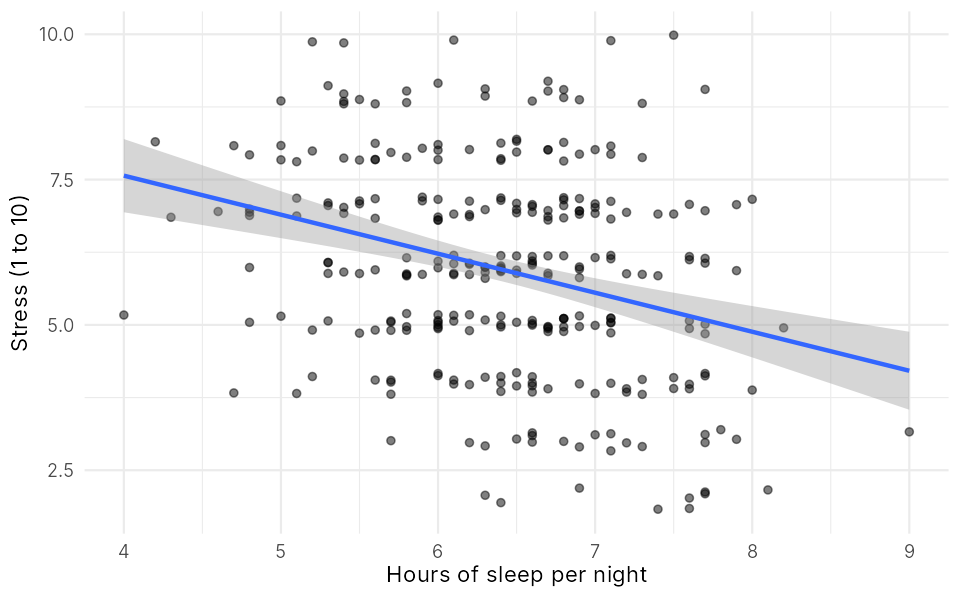
The line goes down: students who sleep more tend to feel less stressed. geom_jitter(height = 0.2) nudges the points up and down a little, because stress only takes whole numbers and many points would sit on top of each other.
Key points
- Boxplot: a number across groups. Scatter plot: two numbers.
geom_smooth(method = "lm")adds a straight trend line.labs()for labels,theme_classic()for a clean look,ggsave()to save.